Appearance Settings
The values for nearly all features may be entered as calculated formulas or variables.
For detailed information about notation in these dialogs, see The fx-Editor. Press F5 after changes to refresh the new settings.
Format
Features for language and general number presentation.
| Setting / values | Explanation | Example |
|---|---|---|
| language | leave empty for automatic language detection or set language name: QlikView: german, english, ... Qlik Sense: de, en, ... | |
| currencysymbol character basically used currency symbol (default is the Euro sign "€") | Defines the basically used currency symbol in NPGeoMap. Especially for the presentation of numbers in the legend there's a specific setting in the fx-editor COLOR & SIZE CLASSES which overwrites the setting in this feature. | |
| numbers format basically used number format (default ist 0,0.00) | Configures the general format and notation of calculated numbers in NPGeoMap such as numbers in the legend, in selection areas or distance information. The following tools and variables are available: comma , = thousand separator period . = decimal separator dollar sign $ = currency symbol percentage sing % = converts number values in percent and display a percentage sign abbreviation a = number abbreviations like "Mio", "Tsd" etc. In Addition space characters and other symbols can be used directly. Example (Screenshot on the right): "numbers": "$ 0,0", Further examples: INPUT "numbers": OUTPUT _ 1500.25 "0,0.00" 1.500,25 1500.25 "0" 1500 1500.25 "0,0.000" 1.500,250 1500.25 "$ 0,0.00" € 1.500,25 0.9 "0,0.00 %" 90,00 % 0.9 "0,0%" 90% The used characters for the thousand and the decimal speparator are assumed from the settings in the Qlik Script. Which currency symbol should be basically used in NPGeoMap is configurable in the setting above. Especially for the numbers in the legend, this can be overwritten in a specific setting currencysymbol in the fx-editor COLOR & SIZE CLASSES. | 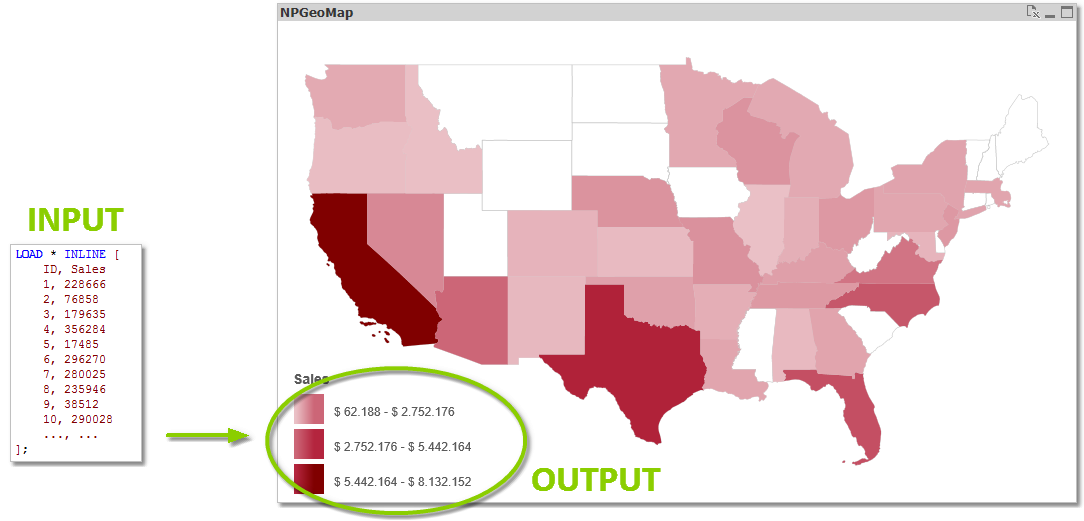 |
| usemetricunits 1 use metric units in NPGeoMap (default) 0 use miles and feet in NPGeoMap | Defines the basically used unit system for calculated numbers (like the displayed numbers in the legend, in selection areas or distance information) in NPGeoMap: 1 = use metric system (default) meters, kilometers 0 = US/UK system (United States customary units/Imperial units) miles, feet | 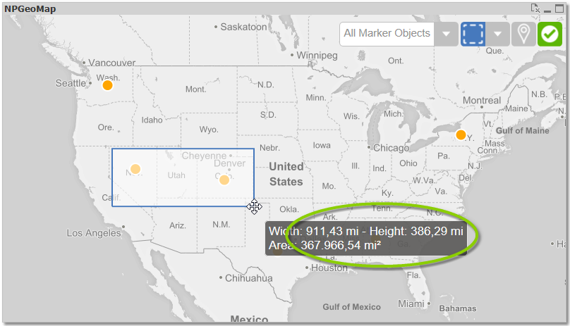 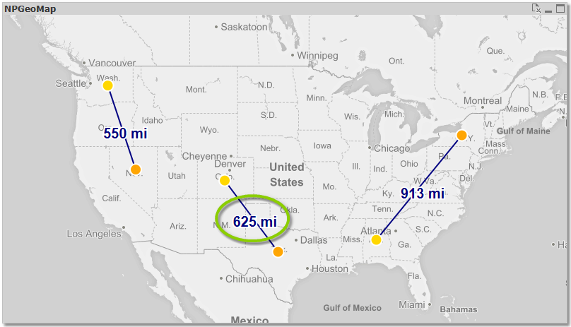 |
Design
| Setting / values | Explanation | Example |
|---|---|---|
| style | CSS class style middle name for menus and buttons - adapt file QlikView: "...QlikView\Extensions\Objects\NPGeoMap_v3\NPGeoMap_v3_Basic\lib\npgeomap\npgeomap.css" Qlik Sense: "...Sense\Extensions\NPGeoMapSense_v3\lib\npgeomap\npgeomap.css" | |
| QlikView only borderwidth | QlikView only: border width of the NPGeoMap object | |
| opacity | set opacity of background layer - opacity of background maps (tile maps) is set inside TILE PROVIDER SETTINGS | |
| backgroundcolor color Background color in the object (default is white) | background color for baselayer (no background map/tileserver)- default value = "white" |
Tooltip
MouseOvers or Tooltips are small fields with short information which appear when the cursor hovers over a dynamic object in the map.
| Setting / values | Explanation | Example |
|---|---|---|
| showdelay number delay of MouseOvers in milliseconds (default is 0) | Defines a delay of displaying MouseOvers (Tooltips). That means MouseOvers won't be displayed in the moment when the cursor hovers over a dynamic object, but it appears until the cursor rests a here defined time on the object. It prevents annoying and unintentional flare-up of MouseOvers when working in the map. Example``: "showdelay": 0,  no delay - the MouseOver will appear immediately "showdelay": 400, MouseOver will appear when cursor stays for 400 milliseconds (0.4 sec) on the object | |
| hidedelay number duration of MouseOvers in milliseconds (default is 5000) | Defines the duration the MouseOver (Tooltip) is displayed. As long as the cursor doesn't move the MouseOver will be displayed for the here set time. MouseOvers always disappear when the cursor moves. Example``: "hidedelay": 1000 MouseOver will be displayed for 1000 milliseconds (1 sec) "hidedelay": 5000 MouseOver will be displayed for 5000 milliseconds (5 sec) |
Selection drawings
 Tip: There's a CSS file "info.css" located in the NPGeoMap Extension directory (subfolder "css"), which can be customized to define the default presentation of PopUps, MouseOver and SketchBoxes. (If you configure this file make sure to save a backup, when installing an NPGeoMap update - the actual file will probably be replaced.)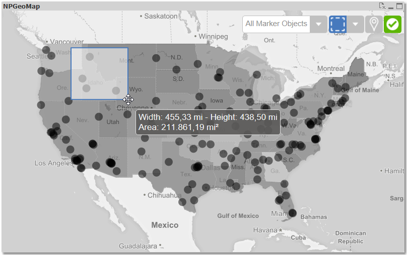
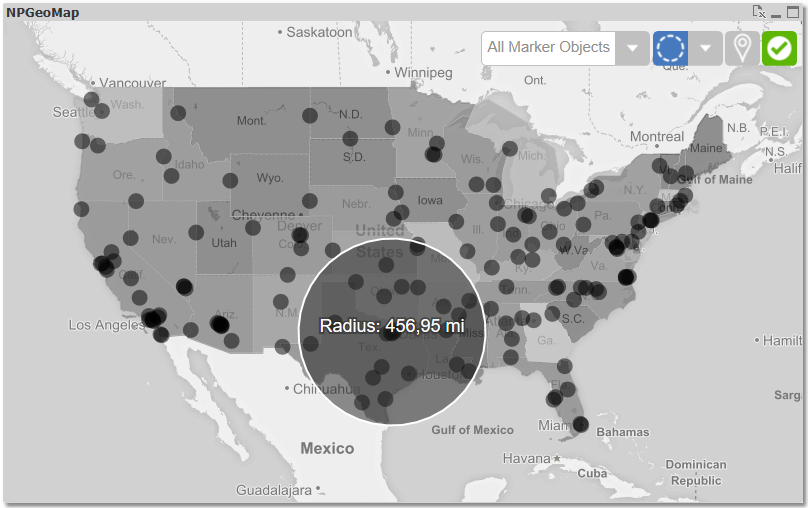
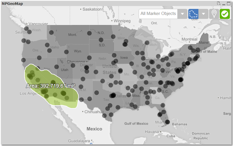
Menu
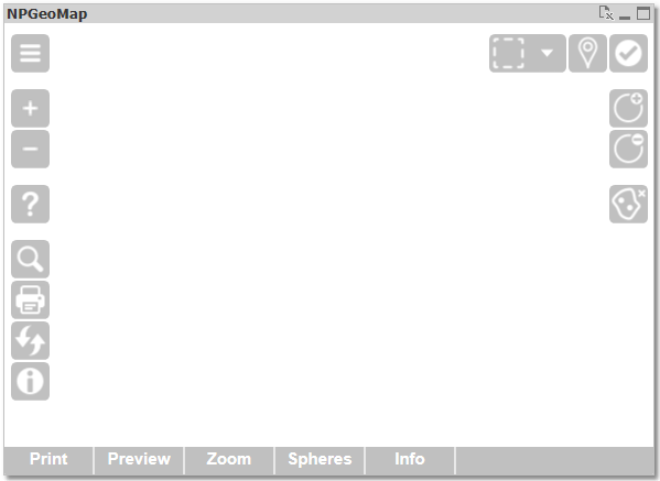
In this section are various settings for optimizing the user interface, like configuring the menu bar, the touchscreen menu, the selection menue or other operating elements. Furthermore there's a setting for the language in NPGeoMap and a special button which can automatically allocate Markers to their respective geographically related Polygon. All menu items can be combined arbitrarily. Only "active" (the menu bar) and "touchscreenmenu" have a either-or relation, whereby the second one has priority.
| Setting / values | Explanation | Example |
|---|---|---|
| fadeduration | 0 = always visible, 10000= ten seconds until menu fades out (setting in milliseconds) | |
| lockview | 1/0 or true/false - shows/hides lockview button | |
| lockviewpressed | state of the "lock view" button: -1 = manual, 0 = off, 1 = on to hide the button set "zoom": 0, | |
| extended | 1/0 or true/false - shows/hides the extended user menu | |
| helptype | 0=Online Help 1=Offline PDF | |
| layerswitch 1 Layerswitcher enabled (default) 0 Layerswitcher disabled | Displays the Layerswitcher. This button allows a very easy "turn on/off" of all configured layers in the object like the Markers, Maps, Lines, Background, ... Just tick or untick them as you need. Unticking layers don't mean they're disabled - they are simply not visible. If a layer is actually not needed, disable it in the properties menu for better performance. |  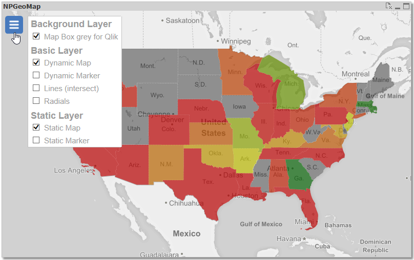 |
| zoom 1 zoom buttons enabled (default) 0 zoom buttons disabled | Displays the Zoom Buttons. | 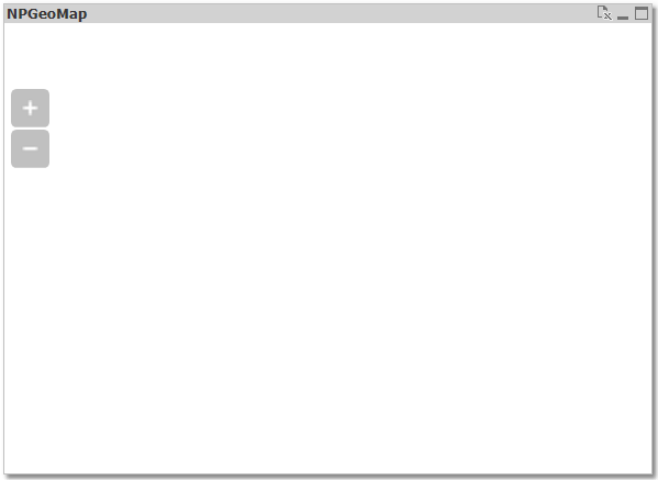 |
| search | 0=off, 1-4=on, pin Color(Black, Red, Orange, Green). A valid google api key (Set in: Options/Tile Provider Settings) is required. | |
| selection 1 Selection Menu and Selection enabled (default when selectable items are configured in the object) 0 Selection Menu and Selection disabled | Displays the Selection Menu and Note: enables or disables the Selection itself. The Selection Menu and the Selection are enabled by default, but the menu only appears when selectable (dynamic) items and layers are configured in the object. If you disable this feature, dynamic objects can't be selected anymore, not even with keyboard shortcuts (Ctrl for single selection, Ctrl+Shift for multi selection). | 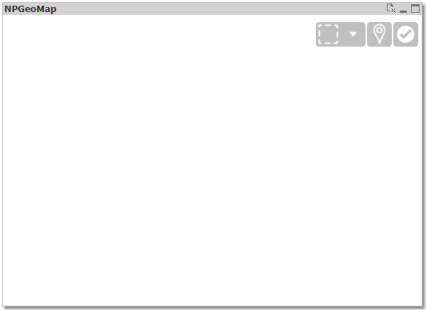 |
| toggleselection 1 toggle selection enabled 0 toggle selection disabled (default) | Displays a flip switch beneath the selection menu, to switch between default selection mode and toggle selection mode. oToggle selection - same selection dynamics as in Qlik: Objects are added to or removed from the selection like turning them on or off. If objects are marked, which haven't been selected yet, they will be added to the current selection. If objects are marked, which are already part of the current selection, they will be removed from it. As always, selecting the last remaining object again clears the selection (this applies for both selection modes). oDefault selection - same selection dynamics as in QlikView: Marked objects are selected, all others not. Using this flip switch overwrites the configurations in the feature togglemode further below. This feature allows the end user to change the selection mode directly in the object. The related feature togglemode is a developer tool to basically set a selection mode. To see which of the two modes is active in the object, even if the flip switch isn't displayed, the green OK button changes and shows a small plus sign in toggle mode (see screenshot). | 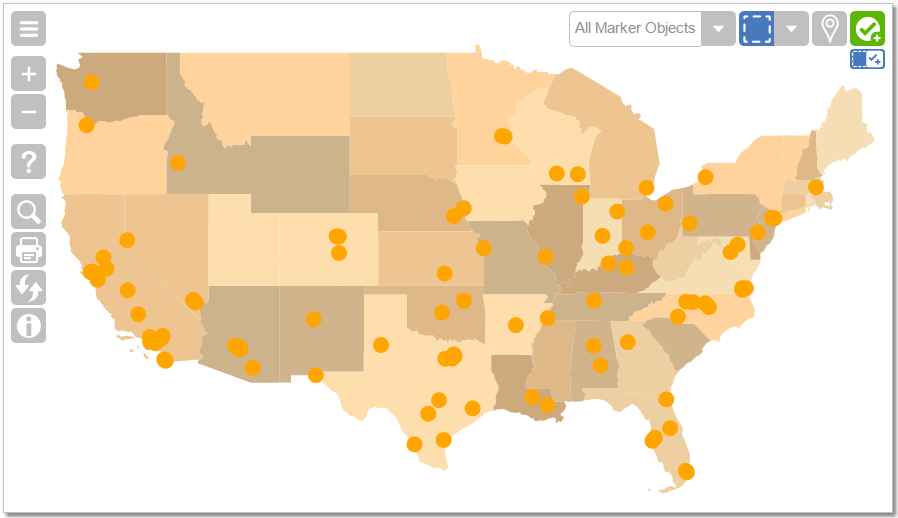 |
| exportintersections | Button on the right side - export all current Radial Spheres and Isochrone, using ".NPGP" Map file format. Only visible, if Spheres Layer is enabled. | |
| mapmaker | Enable a menu panel to draw your own maps, directly in the NPGeoMap object. After that export them and load it as Map file. | |
| showScaleLine | 1/0 or true/false - shows/hides a dynamic ruler at bottom of the map to give you information on scaling (changes with zoom level) | |
| layermanager | Button in the bottom right corner - opens a window to manage Data Layers. 0 = off 1 = on (default) 2 = only in QlikView Desktop |
Print
Features for printing.
| Setting / values | Explanation | Example |
|---|---|---|
| format | Page format e.g.: "A4","A3",.. | |
| orientation | "p" = Portrait, "l" = Landscape | |
| filename | PDF Filename | |
| header | Text printed in header | |
| headerfont | Size, style(normal,bold) and name of font: courier, helvetica, times |
Legend
Features for the legend when using Scale Classes.
Right
| Setting / values | Explanation | Example |
|---|---|---|
| scale | scale size of legend in percent - values under 100 reduce and over 100 enlarge the legend | |
| width | -1 = autosize, 10-800: minimum width of legend panel in pixels | |
| backgroundcolor | background color of the legend panel | |
| backgroundopacity | background opacity of the legend panel in percent |
Left
| Setting / values | Explanation | Example |
|---|---|---|
| scale | scale size of legend in percent - values under 100 reduce and over 100 enlarge the legend | |
| width | -1 = autosize, 10-800: minimum width of legend panel in pixels | |
| backgroundcolor | background color of the legend panel | |
| backgroundopacity | background opacity of the legend panel in percent |
Float
| Setting / values | Explanation | Example |
|---|---|---|
| scale | scale size of legend in percent - values under 100 reduce and over 100 enlarge the legend | |
| width height | -1 = autosize, 10-800: minimum width of legend panel in pixels - if content is higher, scrollbar appears | |
| top bottom left right | space between map border and legend border in pixel from TOP, BOTTOM, LEFT and RIGHT -1 = autosize | |
| backgroundcolor | background color of the legend panel | |
| backgroundopacity | background opacity of the legend panel in percent |